Designed the 2022 annual report for World Education. Worked with communications professionals and subject matter experts to ensure the report illustrated a strong narrative throughout.
Peruse the full report below and read on for process details.
To begin this project, I researched some recent reports whose layouts I felt were successful for a variety of reasons. See the results of that process here. I then worked with a Communications Coordinator to refine these ideas and make sure they were feasible for the content that World Ed staff had available for the report.
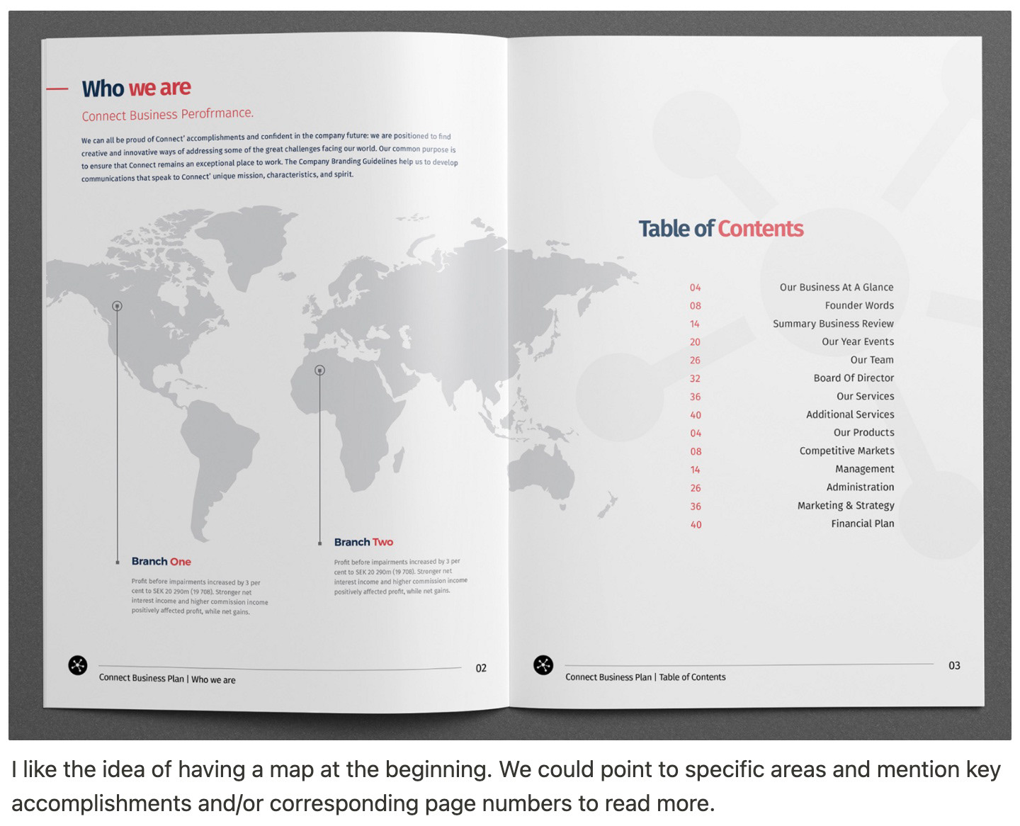
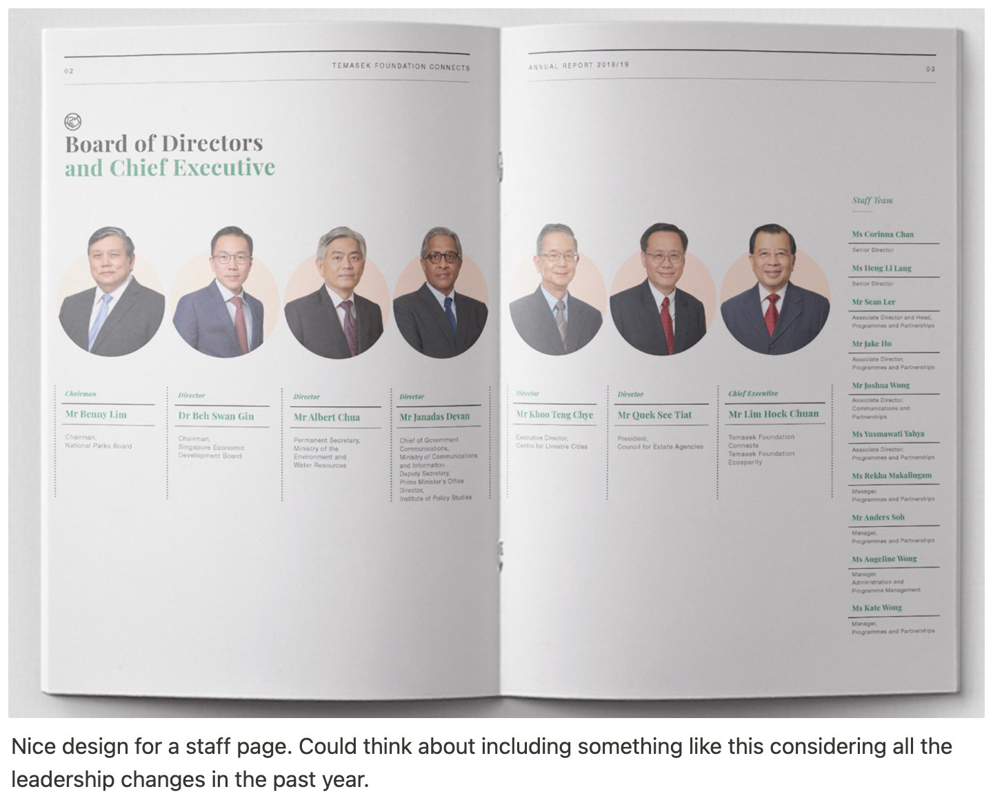
Above: layout inspiration and my notes about the designs. See full inspiration process here.
After gathering inspiration, I reviewed previous years' report designs to understand how the design could be improved. Read below for details about how spreads from 2021 compare to those from 2022.
In the 2021 annual report spreads (example above), the overall design feels heavy due to a large block of color at the top. With key data points placed within this header, the takeaways lack clear visual context for where World Ed's work takes place. Further, bold text is overused throughout the many paragraphs on each page.
In the 2022 spreads, I added country outlines to complement each block of text related to a specific country. I ensured each key takeaway was paired with a photo to strengthen the overall narrative and add a human element to the statistics. The spreads are more balanced overall with lightened colors and varying layouts throughout the report.
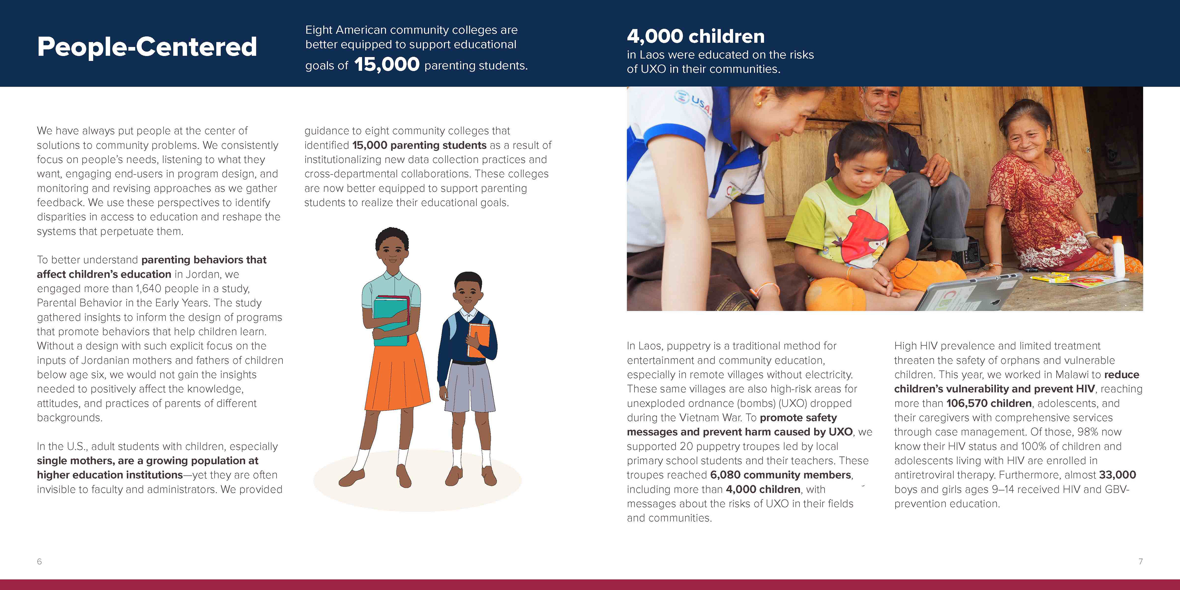
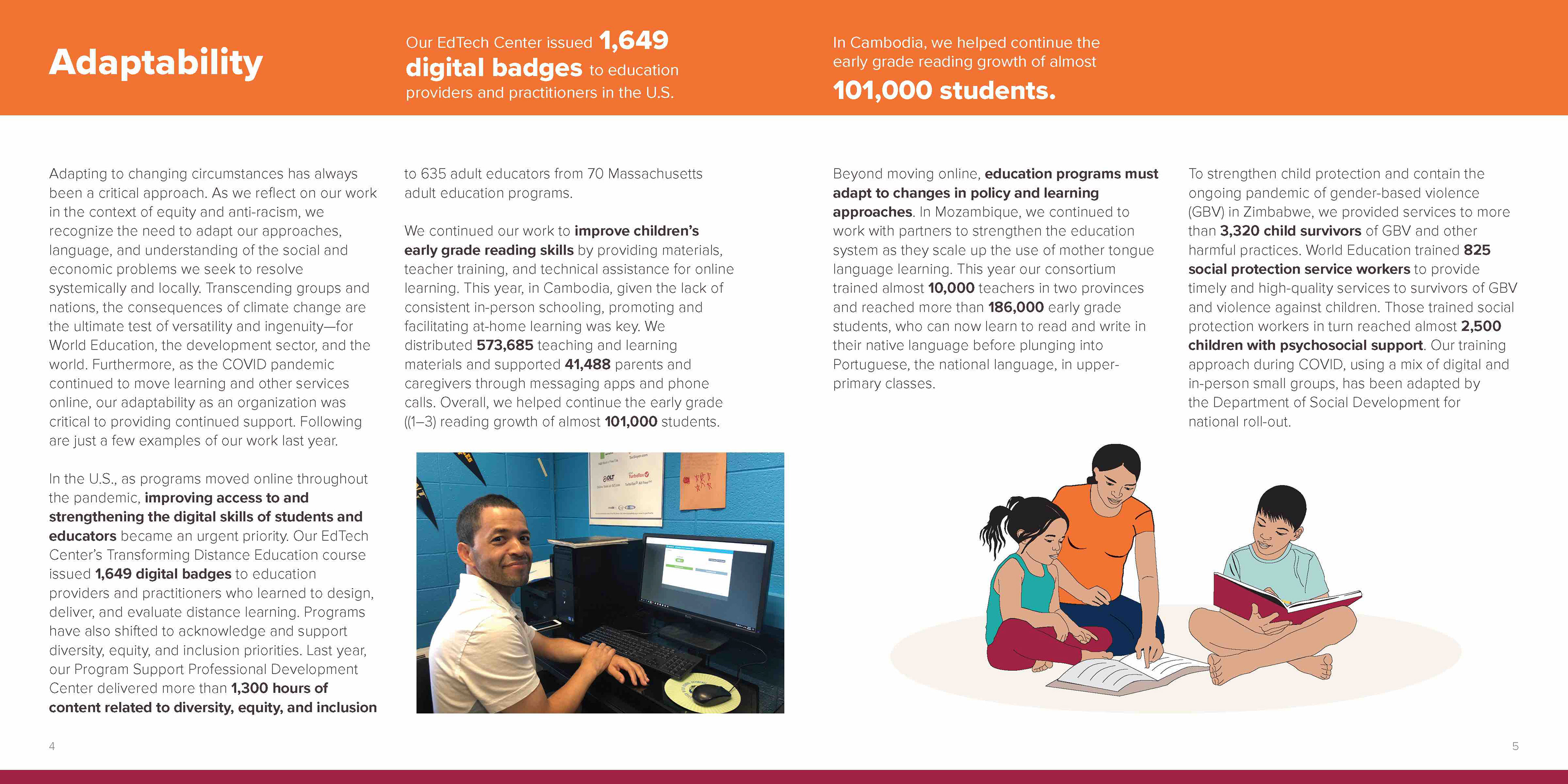
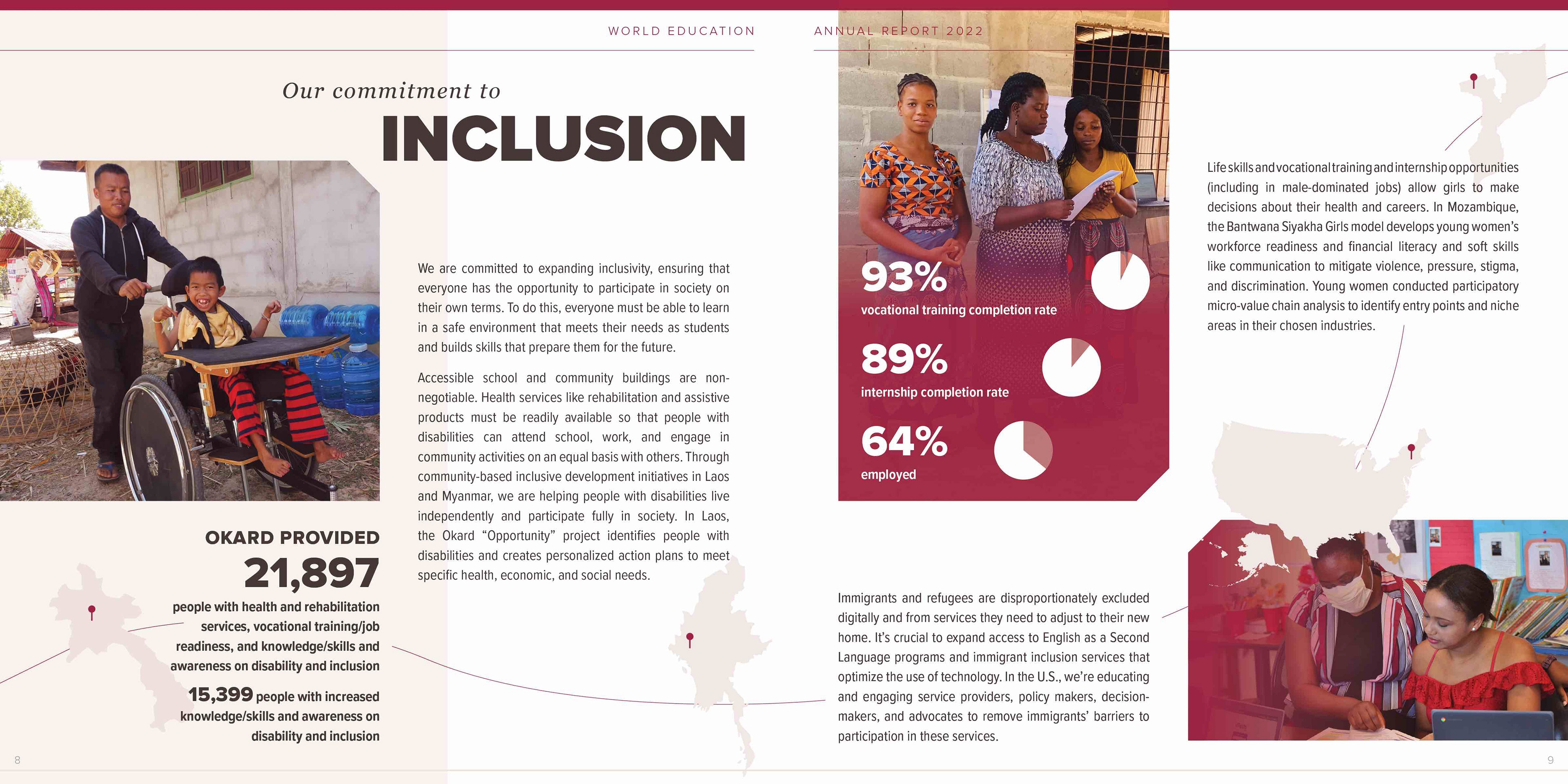
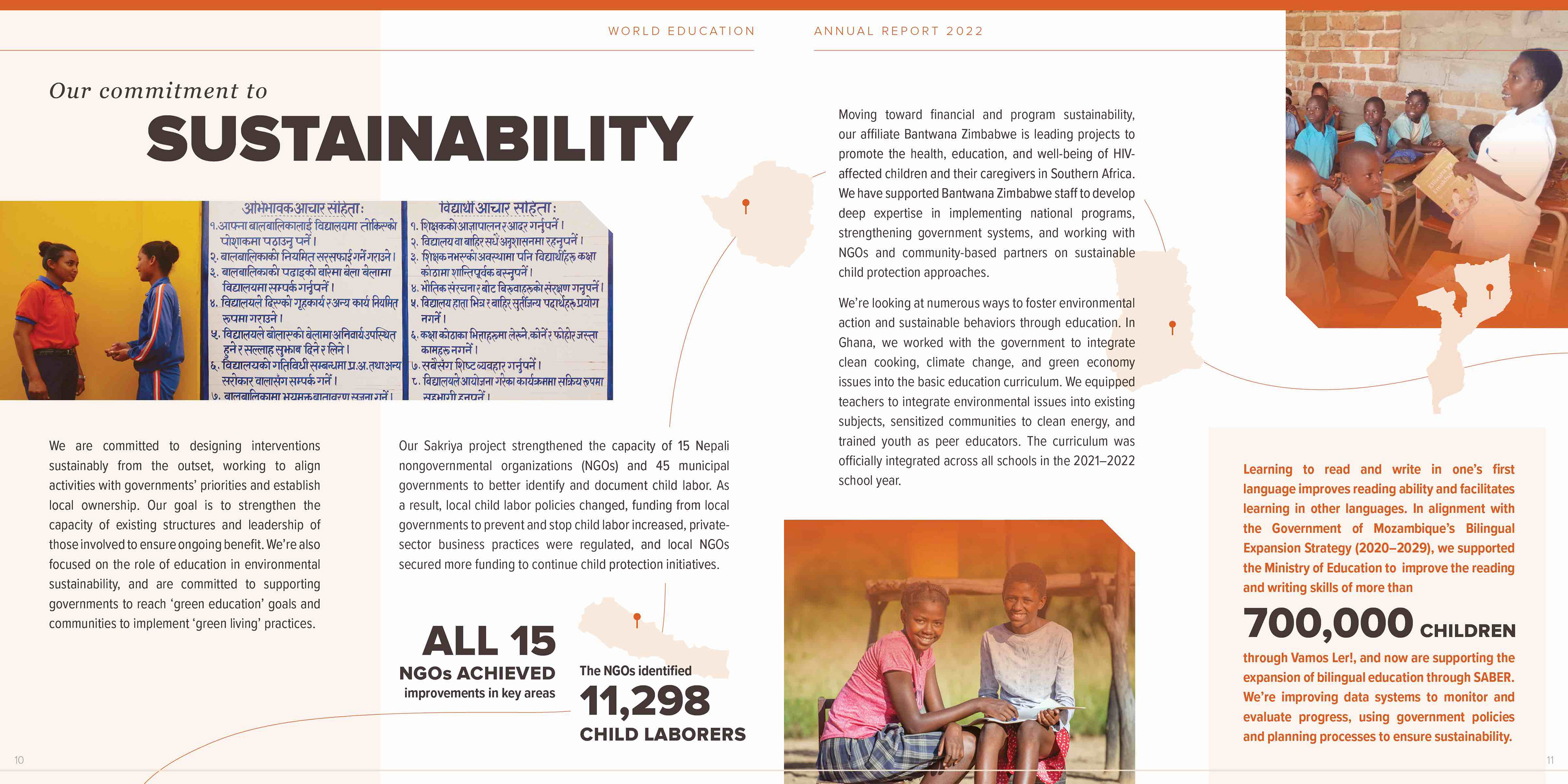
Above: additional comparisons between annual report spreads from 2021 (top) and 2022.
The final report was well-received among World Ed leadership. As of March 2023, it has been published online, printed and distributed among the organization's stakeholders, and taken along to several conferences and events.
