Audience: Individuals and organizations unfamiliar with Operation Fistula
Tools used: Google Sheets, Tableau, Adobe Illustrator and Photoshop, pencil and paper
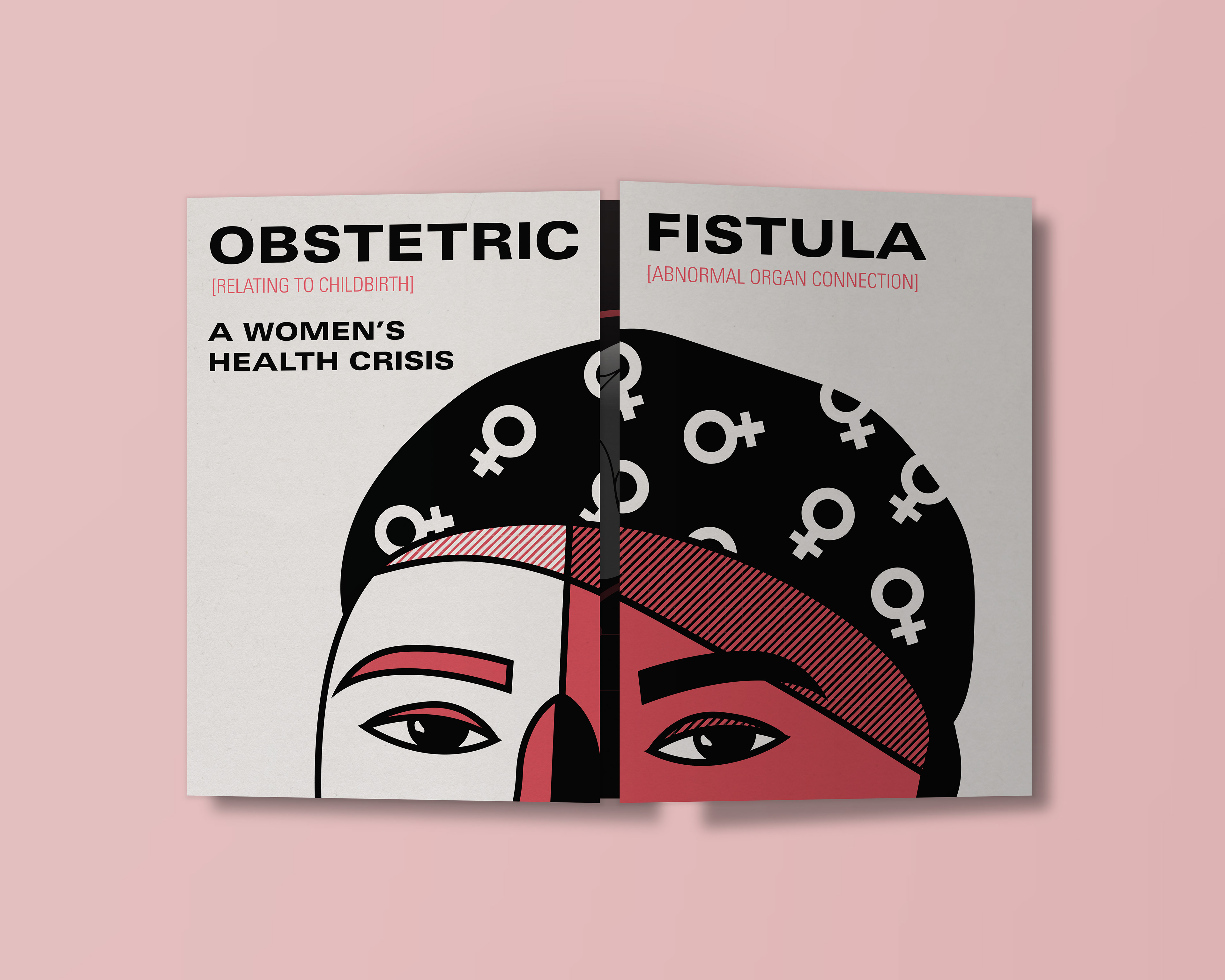
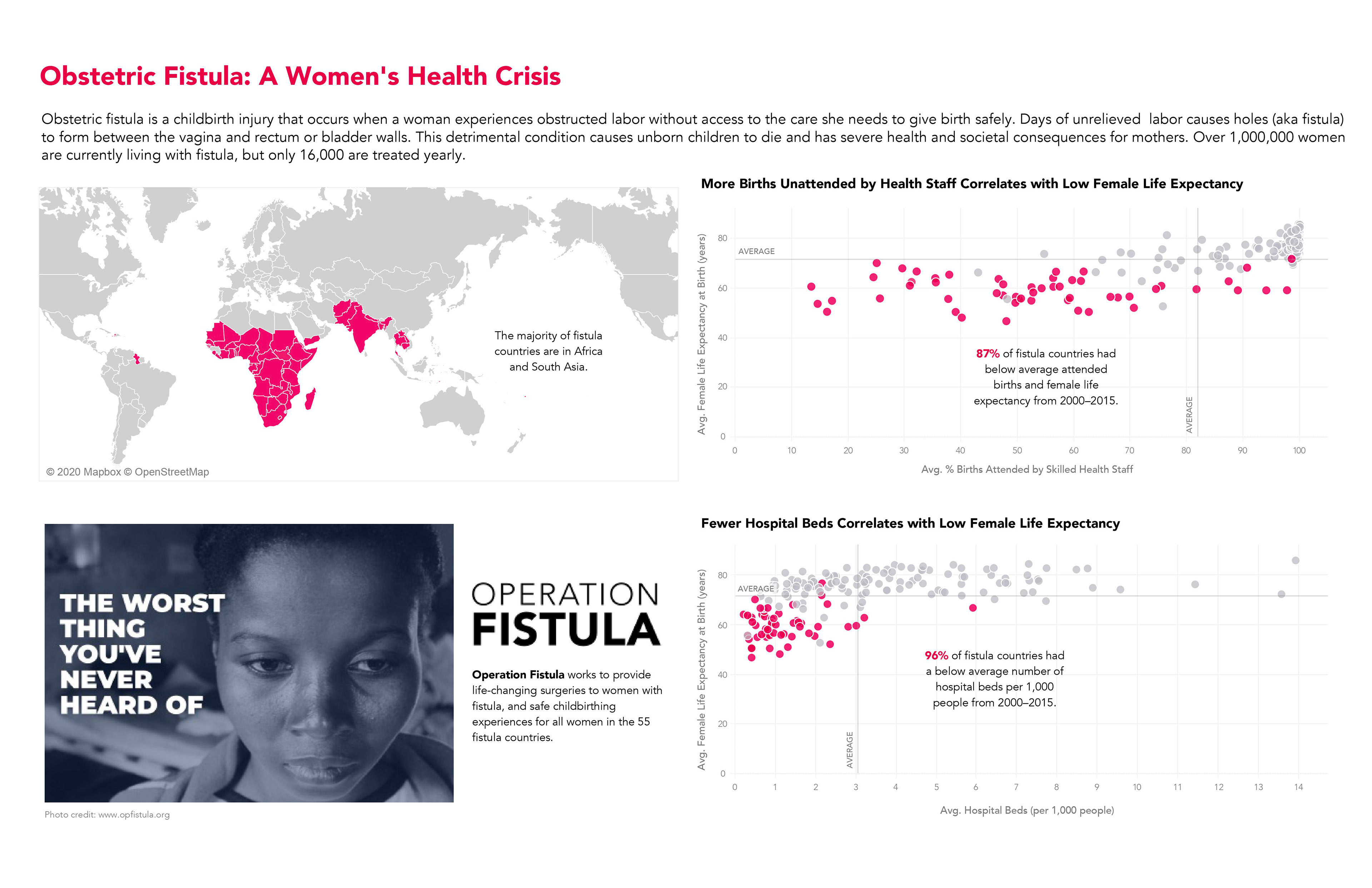
I wrote and designed “Obstetric Fistula: A Women’s Health Crisis” as a passion project, using data sourced from Makeover Monday's collaboration with Operation Fistula and the World Bank. The final spread details what obstetric fistulas are and how they affect women in developing countries.
This design was longlisted in the 2022 Information is Beautiful Awards. Read on for process details.
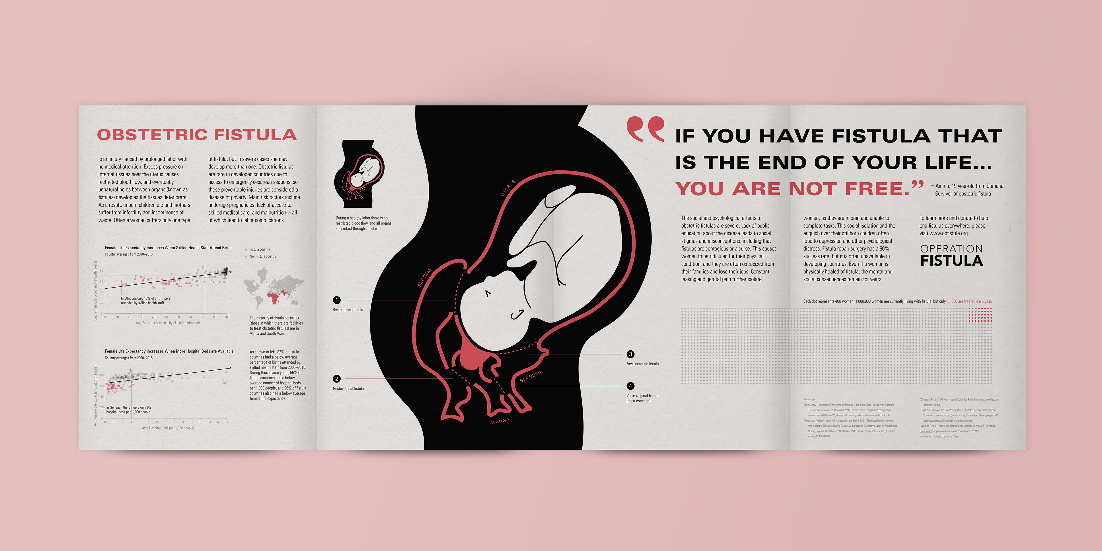
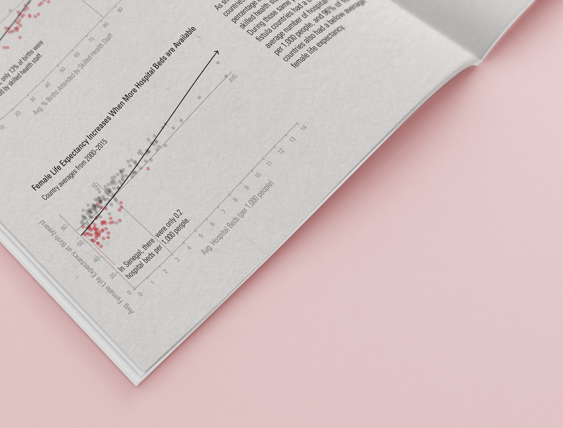
To begin this project, I cleaned up the original data in Google Sheets for use in Tableau. During this process, I began to ask key questions that guided my research, such as: "which countries have facilities for treating obstetric fistulas?" and "how does life expectancy in those countries compare to other countries around the world?"
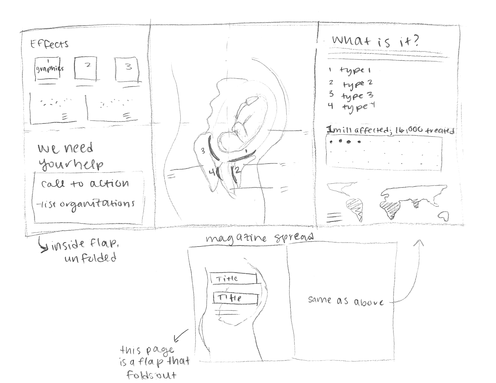
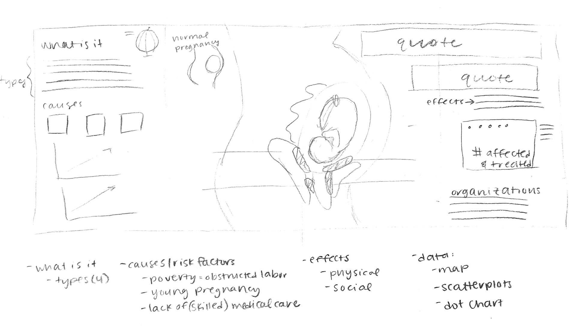
I spent about half of my time for this project learning about obstetric fistulas, ensuring I understood the causes of this health condition as well the life experiences of affected women. It was important to me to focus on the humans behind the data. I wrote out a storyboard to define a specific narrative for the overall data visualization, and distilled a few paragraphs to add context for the map and charts.
After creating the main chart elements in an interactive Tableau dashboard, I illustrated the center diagram in Procreate, sketched out some layout options, and finalized the layout and illustrations in Adobe Illustrator.
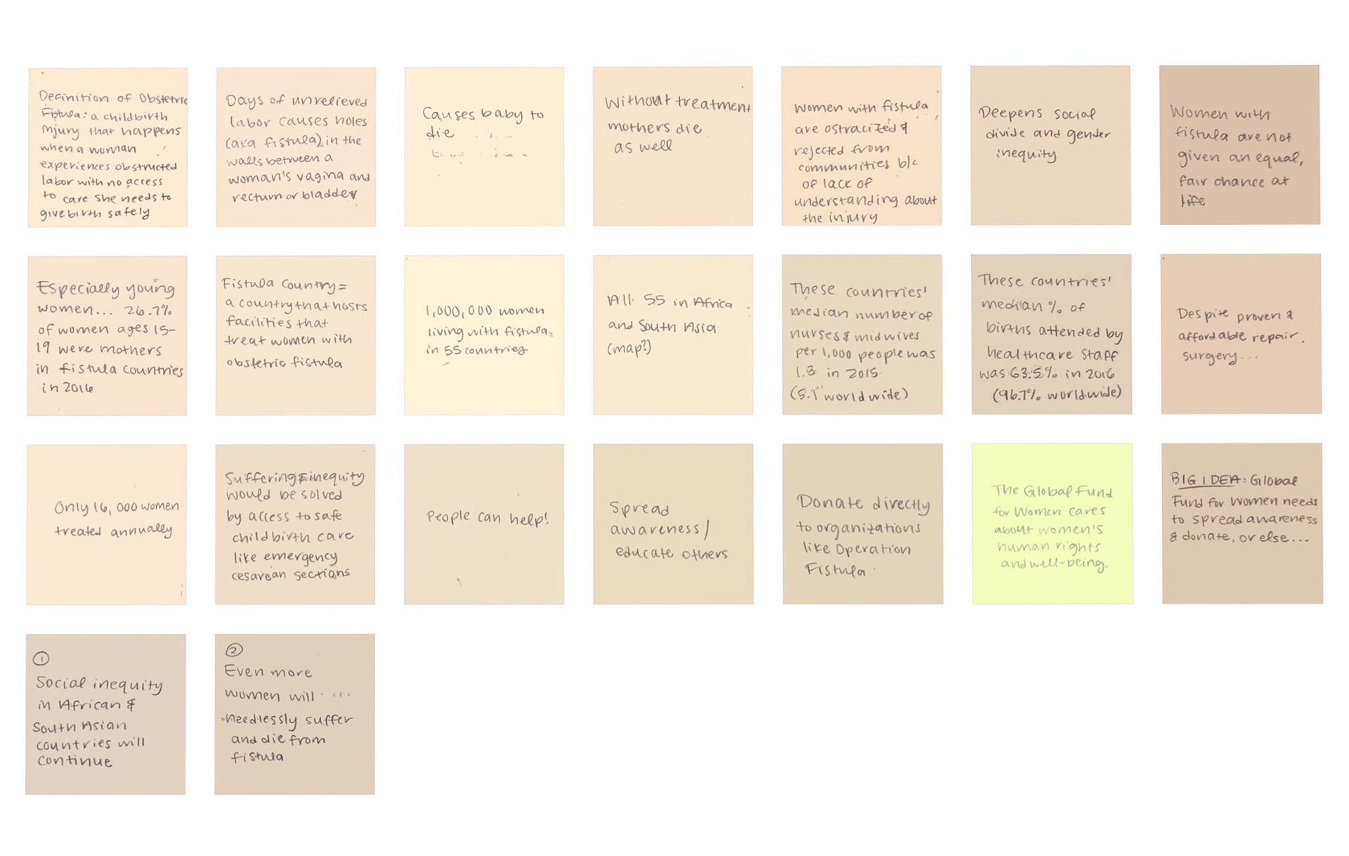
Post-it note storyboarding to pinpoint the main message
Interactive Tableau dashboard